My friends, family, and Instagram followers know that I can slay a charcuterie board. There's just something about charcuterie boards that I find creatively challenging and fun. Just to keep it interesting, I've also never created the same spread twice, despite using the same boards and ingredients. Whenever I post, I'm always bombarded with comments of utter disbelief. So with us being on the heels of holiday entertaining, I thought it would be the perfect time to share my foolproof strategy for creating your best, Instagram-worthy charcuterie board. 


Below is my go-to list of ingredients. This is my approach for every single board I make. Sure I tweak the ingredients every now and then, but for the most part, I always stick to the following strategy:
  • 2-3 Fruits
    • Anything that can survive in bite sizes or slices
    • Green or red grapes (visually they do a lot of heavy lifting). If you're serving wine, let your grape selection guide you.
    • You can also try cherries, tangerines, or sliced strawberries
  • 2 Hard or Medium-Firm Cheeses
    • Some of my favorites are extra sharp cheddar, Parmigiano Reggiano, Gruyere etc.

Round charcuterie board

  • 2 Soft Cheeses
    • A brie wheel looks super sophisticated and always yields more cheese than you think it will. Drizzle it with some honey to really get the party started
    • I also like brie, goat cheese, and gouda
  • 2-3 Meats
    • Prosciutto - the most economical way to purchase prosciutto is to have it thinly sliced at the deli counter in your local grocery store. A half pound is usually plenty for one or even two boards. Pre-packaged prosciutto is usually twice to three times as expensive for the same amount, so keep that in mind if you're trying to stretch your dollars.
    • Cured Meat - I'll usually select one with heat and one without heat for some variety. If they come sliced, great! If I purchase a stick of cured meat then I'll slice them into rounds or at an angle.

Round charcuterie board

  • 1 Pack of Artisan Crackers
    • Skip the flavored crackers and go for a mild-tasting one so that they don't compete with the cheese
  • 1 Loaf of Crusty Bread
    • I like to buy a loaf of artisan bread
    • Slice it thinly, drizzle with olive oil, season with some kosher salt and ground pepper, then bake it for 8-10 minutes 

Round charcuterie board

  • 2 Spreads
    • I like at least one sweet and one savory
    • Honey, grain mustard, jams, or preserves work great
    • A small container of olives is also a good way to go (just let guests know if the olives haven't been pitted because absolutely no one likes a cracked tooth, regardless of how wonderful the board is)
  • 1 Herb of your choice for garnish
    • While not at all necessary, herbs take your presentation to the next level!
    • Try rosemary, tarragon, thyme, or even oregano. 
    • Oregano is my favorite because it's actually edible, and you can sandwich it between crackers and other ingredients.  

Now for tips on building your best board:
Of course using an actual board is ideal (hence the name Charcuterie Board), but it doesn't necessarily need to be a wooden board. A neutral color tray, platter or large plate also works. The thrift store is perfect for this! I have a few boards from IKEA and Target, but one of my favorite vessels is actually a wooden chip and dip bowl that I thrifted. Just don't use your beat up cutting board. We're trying to elevate, remember?

Round charcuterie board


Small matching containers make your spreads feel cohesive on the board. The ones I currently use are thrifted, but small lids or little condiment cups also work. 

Consider cutting your hard cheeses, then fan them around the board in different areas. I typically leave the soft cheeses whole and provide cheese knives for them.

If you don't feel like selecting individual cheeses to purchase, check out a pre-packaged cheese flight or a pre-packaged sliced cheese variety pack in your grocery store deli section. Once you shed the packaging and place them on your board, no one will ever know. :)


Bunch your Prosciutto in clusters and spread them around the board for visual texture.

If your cured meat comes in large rounds, consider creating little roses with a champagne glass like this!

My biggest tip is to use a smaller board and fill it to the brim! It's the feeling of abundance that makes a charcuterie board feel decadent and special.

And because I'm nothing if not honest, I wanted to show my very first charcuterie board:


Whoo!!!! See how far I've come? This was my second board:


See how I progressed from the first to the second?

I'm sharing this with you because I want you to know that with practice comes progress. Not only has my ingredients list stepped up a notch (looking at you, Ritz crackers), I've also gotten progressively better at presentation through trial and error. Try it out, have fun, and keep experimenting. Eventually your boards will not only be a feast for the stomach, but also a feast for the eyes! If you try out any of my tips, be sure to tag me on Instagram @rajaune so that I can see your creation! Happy board building! -R 
Gosh, I've waited a long time for this post! Today I'm revealing our tiny, colorful powder bathroom makeover! So snuggle in because I'm going to give you a play-by-play for this glow-up. If you missed the first post where I talked about the concept and design, feel free to take a look here.

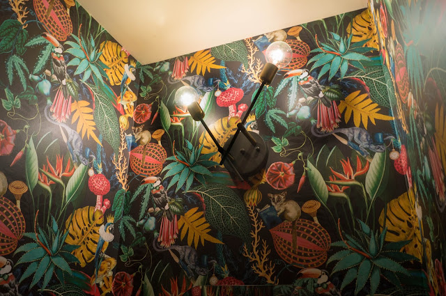
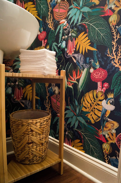
Clearly the star of the space is the wallcovering. You guys, it's so, so, so good! Not only does it incorporate all the colors that we use throughout the rest of our home, it's also a quite unexpected, and dare I say - sophisticated? The dark background ups the chic factor, and we love it!

 As any designer will tell you, a powder bath is the perfect place to step outside of your comfort zone and take a risk. Would I have done this pattern in my master bathroom where I spend close to an hour everyday? Probably not, but this tiny space needed something special and high-impact. It's a place that guests will more than likely visit, and it's also a place where you won't spend too much time, so why not have fun? I looked to the Reverie wallpaper by Albany to bring all the drama. We hired a local installer to ensure that we did this pattern justice. The install was so well done that I could have laid down and cried when I saw it. If you're local to the Atlanta area and need a wallcovering installed, I'd be happy to recommend his services.  


Colorful Powder Bath Makeover Mirror With Shelf


The Mirror in this space is an old West Elm ($50 new in the box) find that I had been holding on to for the last 2 years. I found it on clearance, and I knew that I would want it in our powder bath. I love the shape of it, and the offset shelf provides just the right amount of quirk. With the limited space at the pedestal sink, I wanted space for something pretty (a vase with faux blooms) and something functional (for napkins) which the shelf provides perfectly.

Colorful Powder Bath Makeover Pedestal Sink

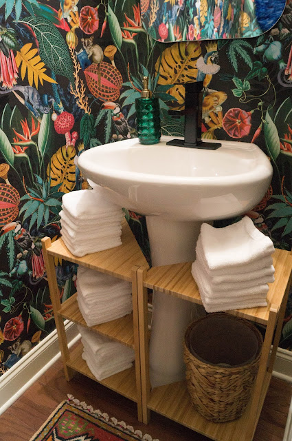
Previously we had a small chrome-plated builder's grade faucet. I searched high and low for a nice faucet that wouldn't break the bank. I knew I wanted black finish, a single handle, and a height that didn't cover up our little parrot king. Our wallcovering installer was so incredible, and strategically placed him front and center above the faucet. I had zero expectations or preference of how the paper should be installed, but when I came in and saw the parrot front and center above the sink and toilet I was blown away!

Colorful Powder Bath Makeover Pedestal Sink Faucet

The faucet is nice and heavy, and feels so expensive, even though I only paid about $50 for it. Now, I would be remiss If I didn't tell you that the install of this faucet didn't come with some crazy challenges. Apparently the most efficient way to install a faucet in a pedestal sink is to remove the sink from the wall. Who knew? Of course we couldn't do that because we had made the mistake of installing the wallcovering first. Let's just say that I'm lucky to I have a husband with hands just the right size to get behind the sink. With the help of numerous trips to Home Depot, plenty of tools to provide the right leverage in a very tight space, and a sweet, "everything is figure-out-able" attitude we were able to make it work.

The soap dispenser is a cute little find from Target. I like how it picked up on the gold in the mirror and light fixture. I selected green for obvious reasons. :) 


The lighting was also a find from Amazon. I wanted something that could take advantage of the 9 foot ceiling. I also wanted something without a shade so that the room could get adequate lighting since the vanity light is the only light source in the space. The asymmetric design adds a little flair to it as well. As you can see, I did deviate just slightly from the original design in that I did not end up painting the ceiling. In hindsight, I'm so glad that I didn't. I think a dark blue ceiling would have made it so much darker in there and sucked up all the light. Right now, I think the space has just the right amount of dark and moody. 

Colorful Powder Bath Makeover Mirror with Shelf

Beneath the sink, I wanted a place for hand towels (which are actually small washcloths) and a bin for used ones. Have you ever been to someone's home for a get together, and by the time you use the bathroom, the one, sad hand towel is completely soaked from all the wet hands that came before yours? Well, I'm not a fan. For years we placed nice, disposable napkins in the powder bath for guests to use, but in an effort to be more sustainable (and sophisticated) I opted for the individual washcloth method that I stole with pride from dear friends of ours (who are the ULTIMATE entertainers). I always said that when I grew up I would do this, and lo and behold - we have arrived.  


I've yet to see a pedestal sink storage solution that is as ingenious as this one from IKEA. It's actually two separate shelving units that when placed together look like one. I removed the middle shelf in the second unit to allow for a bin to place the used wash cloths. It fit perfectly if I do say so myself. 

Colorful Powder Bath Makeover IKEA Ragrund Corner Shelf

The bin is a Target original that I found on Ebay after I spray painted my original woven bin black and immediately felt as though I had made a mistake. It looked like black hole underneath the shelving unit, and I wanted the whole ensemble to feel like one. I managed to find a bin on Ebay that was brand new with tags and was the exact same size as the first one. I even like this one better. Looks like it was meant to be.  

Colorful Powder Bath Makeover IKEA Ragrund Corner Shelving


Colorful Powder Bath Makeover Pedestal Sink Shelving

After the wallcovering was installed, I went on a frantic search to find a vintage rug that would complement the pattern. I must have looked at 100 rugs before I found the right one (with the help of my bestie, Camia). It's not even close to being a perfect rectangle, but I think that gives it character.

Colorful Powder Bath Makeover Small Vintage Turkish Rug

Plus, the tassel fringe detail is adorable.

Colorful Powder Bath Makeover Vintage Rug Tassel

Initially I wanted a cheeky print over the toilet, but then I got really indecisive. To be honest, once the wallcovering was up, I didn't want to put any holes in the wall whatsoever. The pattern is really that beautiful. But I couldn't shake the feeling that this wall need something. Eventually I settled on the idea of a Juju hat, but my bestie urged me to go with a color that was underrepresented in the pattern. This blue was so hard to find in the size that I wanted, but eventually I scored on Etsy. 

Colorful Powder Bath Makeover Juju hat over toilet

This size was actually a little bigger than I wanted to go, but again, it must have been meant to be because it fit perfectly. It's the perfect cherry on the wallcovering cake.

Colorful Powder Bath Makeover Blue Juju Hat

In the initial design, I wanted to use a wall-mounted toilet paper holder. However I played around with the placement quite a bit and realized that the most perfect spot for it (that felt the most comfortable) was where the door frame is located. So I decided to use a stand I found on Amazon. It works great (especially because it's the perfect height and I once again didn't have to make holes in the wall). I was happy that this stand also gave us a spot to store extra toilet paper.         

Colorful Powder Bath Makeover Toilet Paper Stand

Of course we had to add a Tushy to this bathroom situation. Brandon ordered a few back in 2019, and they were just waiting to be installed. I think it definitely ups the luxury factor in here. Also the bamboo knob is a nice callback to the vanity shelving. 

Colorful Powder Bath Makeover Toilet Paper Stand with Tushy

The waste receptacle is super sleek and non-descript. Funny story - when this piece was delivered, it was placed against the garage in front of Brandon's car. Not knowing it was there, he accidentally ran it over. This is the replacement. 

Colorful Powder Bath Makeover Yamazaki Trash Can

In regards to the few accessories that I incorporated on top of the toilet, I wanted to keep it as simple as possible. The faux plant and set of bamboo trays are from Goodwill. Instead of typical bathroom spray I picked up some Flush Ritual from Homegoods. 

Colorful Powder Bath Makeover Toilet Tray

P.S. The outlet and switch plates are my favorite. I'm now thinking that wallcoverings are the tattoos or Lay's Potato Chips of the design world. With tattoos, you're always planning the next one, and with chips you can't have just one. Our next wallpaper project? Probably the laundry closet or the upstairs hallway. :) 

Colorful Powder Bath Makeover Wallpaper Outlet Switch Plate

And because there's nothing better than a before and after... 


So what do you think? I'm in love. 


Powder Bathroom Makeover Reveal Sources 

Pedestal Sink Shelving - IKEA Ragrund Sink shelf/corner shelf
Turkish Oushak Persian Rug (similar) - VintageRugsLove
Juju Hat (similar) - Artifrice
Toilet Spray - Flush Ritual
Faux Plant (similar) - IKEA Fejka Rosemary or IKEA Fejka Baby Tears
Bathroom Tray (similar) - Celezar Vanity Tray

Recently I was feeling nostalgic scrolling through my Google Drive when I came upon a cute little porch makeover that I had done last summer. Seeing as though we are all finding small ways to spruce up our home right now, I thought I would share this quick refresh with you.  


The recipe for a quick porch refresh:

A wreath 
  • This a dried door wreath from TJ Maxx that I scored on sale for $18.
A fresh door mat 
  • I grabbed this cutie up from Target for $19.99.
A ground planter 
  • I was lucky and found this succulent garden pre-assembled at The Home Depot for $16.
  • Fun fact - the piece it's sitting on is actually a $1 waste basket from The Dollar Tree.  
A planter box for the railing
  • I found this one at IKEA for $7.99 a few years ago and it has held up exceptionally well.
  • I filled it with six full-sun plants from Home Depot which ranged between $3 to $5 each. 
A coordinating color scheme 
  • I like that the color scheme sets the tone for what you'll experience once you've crossed the threshold. Our townhome is so traditional outside (and we can't change anything about our exterior because we have a strict HOA) so adding accessories on the outside really gives it some personality.


We can't change the color of our door, but bringing in bright colors and various shades of green made our sage green door feel more vibrant.  


I love this succulent bucket! Quick tip, this planter also does double duty by covering up the porch outlet. I made sure that all of the plants on our tiny porch contained plants that could receive full-sun a large portion of the day. The succulents loved it out there during the warm months. 


Now the bucket is about 1/3 full because I forgot to pull them into the house this past winter (face palm), but I can always add a few more singles to the fill out the arrangement! 


How adorable and luscious is this "buc" of "succs"? :) 


I really wanted the flower box to feel like a little garden so I varied the types of plants, making sure to select a few that would cascade down the side. I made sure to keep them on the same watering schedule as my house plants so that they were nice and hydrated despite being in the sun most of the day. It was fun to open the door and different flowers blooming every other day. Annuals are fun! 


The wreath could not have been a better match for the flower box! I love it!  

And if you want to try out something similar, here you go! 


Floral Wreath

"Hola" Doormat (I also love this Pillemark rainbow one)

Sommarfest 

Rustoleum Gloss Seaside (to dress up the planter box, of course!)

Succulent bucket

Wastebasket


As we gear up for fall I would love to give the porch another quick pick me up (because it definitely looks a little less polished right now). Any quick makeovers happening over at your place? I'd love to hear about them!

Hey Folks, I'm back in the saddle to talk about my design plans for our guest bathroom. And yes, this makes two bathroom projects! If you missed the previous post about my plans for our powder room, check it out here.


Above is a scheme board for a cosmetic upgrade to our guest bathroom. First and foremost I want to make it a happy place to be by rolling some color onto the walls, and adding a fun shower curtain. I'm also considering an accent wall, but I'm still undecided on that front. What do you think? Our town home has a pretty open living space, and most areas bleed into the next. Therefore I think the bathrooms will be the only places where I'll be able to experiment with different paint and wall treatments, and not mess up the flow of adjacent areas. I'm also leaning towards black accessories in all of our bathrooms going forward, so the fixtures were a pretty easy choice, and blend well with the overall concept

I would replace the vanity fixture (unfortunately this is the only light source in the space so I needed clear globes), the mirror, faucet, and possibly the countertop this go-around if I can find an inexpensive remnant (though the countertop may have to wait). I am also contemplating on painting the sink cabinet because it's small enough to be a do-able DIY. I've seen lots of people on YouTube do it, so it can't be THAT hard, right?  Oh, and I can switch out the knobs for something gold to coordinate. Below is a quick sketch.


Prior to purchasing our home, I COULD NOT GET OVER the fact that we had fiberglass tubs with shower surrounds and acrylic sink tops in our bathrooms (especially because our former apartment in the city had tile, porcelain tubs, and granite). But over time, I guess I've realized that this is simply the reality for most people, and that eventually we can remodel the bathrooms to make them exactly what I want. In the mean time, I would like to do a makeover so that this space can look and feel well... designed. It was haphazardly put together from the beginning, and is totally not a reflection of the rest of our home. Currently, the bathroom is super blah and somehow felt even worse when I went to take photos of the space. 


I mean... it's not great.  There is no rhyme or reason to the color scheme. In the beginning I just found a shower curtain and matching rug in Target, hung up some extra cabinets for storage, and called it a day. It's bad. Don't @ me.  


On this side of the bathroom is where I would like to place the towel ladder. I could do hooks here (and based on size of the area that might just be optimal, however I really wanted to do something different, so I'd like to make hooks my plan B.

Oh, and can we talk about the area above the shower curtain? I really love the technique of installing the shower curtain rod near the ceiling, and using ball chain as an extension. This design detail will add much-needed visual height to the standard 72" curtain. 


Kristin from the Hunted Interior used a ceiling-mounted track system for her installation, but I am also considering a rod, much like the image below.


Emily Henderson used a rod to get a similar effect, and I LOVE the gold. I still need to make some decisions about the application, as well as rod and chain color. I'm leaning towards black to coordinate with the fixtures.


Moving right along... this is perhaps the worst part of the bathroom for me. These canvases were acquired on a trip to Charleston back in our newlywed days, and used to live in our former office. The canvases are so wonky that this photo actually makes them look better then they really are. Here I would do hooks for hand towels above the sink, and framed artwork (obviously nothing too precious due to the moisture) behind the door. 

So that's pretty much it! I'm sincerely hoping that this is something I can do myself as a fall project. I've already ordered the shower curtain and rug, so this makeover is DEFINITELY happening!  Do you have any house projects you're planning? I'd love to hear about it!


If you've been following me for a while, then you know that thrifting is one of my absolute favorite pastimes! What can I say... I just love digging for "buried treasure"! Aside from vintage items giving your home a sense of soul (particularly when your home is devoid of much age or character like ours), fun vintage pieces can also add a much-needed smile to your face (especially in 2020, am I right?).

Back in 2017 I blogged about the humble vintage glassware collection that I began on a whim. Flash forward almost three years later, and a 12-piece glassware collection has turned into a collection of well over 100! 


I almost have a whole rainbow now! How amazing is that? Of course I would be remiss if I did not pay homage to the blogger who inspired me to start looking at vintage glassware in a whole new light while  out thrifting. Honestly I used to pass glassware over at the thrift store (unless they had a cool pattern) but after seeing how much of a statement they could make, I couldn't resist adding them to our home. Now I can't imagine our little entry any different. The collection really puts a smile on my face each and every single day. 


Naturally as the collection grew and grew, I began to run out of space. I find that this often happens with everything that I start to collect (I'm looking at you, ginger jars and decanters). My old Vittsjo shelving unit was completely full, and I knew that I wasn't ready to stop collecting. So I decided to create more display space with the addition of two new shelving units.  


I know this sounds crazy, but when I removed all of the glassware so that I could build and install the new shelving, I could not believe how many glasses I actually had. For reference, our dining table is approximately 95" in length! This was the first time I was able to place them in rainbow order, and I must admit... it was stunning. 


The only color I have yet to collect is red, but overall I'm pretty happy with the collection. I'm still on the hunt for some beautiful ruby red depression glass, so maybe I'll get lucky one day.


Now, onto the new shelving units - the piece I selected is the Nathan James Theo 5-Shelf Ladder Bookcase with Brass Metal Frame in the White/Gold Finish. And I am going to be "100" with you - this is not the type of shelving unit that is suited for side-by-side install. The shelving and brackets don't line up exactly, so it can be a real pain to install them right next to one another. If I had about a foot between the two units, I doubt if it would actually be a problem, but I was working with very limited space. Initially I wanted the units touching for a seamless look, but because the shelves and brackets did not line up exactly, we opted for 1/2" between them to make the imperfections less noticeable. 

Now, this is the part where you examine the pictures up close to determine if I'm a crazy person. Don't worry, I'm not -  I promise. However the combination of the photos, the angled wall, the small space, and the wide angle lens makes a difference in how this solution is presented.  Overall I'd give the unit a 3/5 stars, but as my hubby reminded me after my pouts of perfectionism - this does not have to be your forever solution! Plus when I filled the shelving up, the glassware totally distracted from the imperfections of the shelving unit itself so I can live with it for now. Who knows? In a year or two I may want something completely different. But for now it's pretty, and I'm proud of it. 


After going through the process of collecting all of these beauties, I have a few tips that I want to pass on, just in case you're thinking of starting your own collection.

Tips for Collecting Vintage Glassware:

Define your criteria - Decide on what type of glassware you want. Are you looking for depression glass, jade glass, milk glass, specific colors, or just fun shapes and sizes? Do you have a specific price point for what you will spend and what you will pass over? Having an idea of what you are looking for will allow you to quickly scan a thrift or vintage store and make your hunt more efficient.

Check the color - If you're looking for colorful glassware, make sure that the color is embedded into the glass, versus applied on top. You can usually tell this by checking for scratches on the surface of the glass. In other words, if a glass is purple, but has a clear or white scratch, skip it. I made this mistake once, and when I took the glass home to clean and soak in mild dishwater, all of the color melted off and I was left with a clear glass. No bueno.

Check for imperfections- Sure, this seems like a no-brainer, but sometimes you can get so caught up with finding something cool that a small chip might not be discovered until you get home. Of course this isn't an issue if you don't plan to drink out of them, but we definitely use our glasses, and we don't want to risk bringing anything home that isn't safe to use.

Be okay with orphans - I'll admit, I've been pretty lucky to stumble upon entire sets of glassware, but more often than not they come in odd numbers, or in singles. This is often the nature of donated items, and you know what? That's totally okay! The more mixed your collection is, the cooler it will be. And if you like to entertain, there's nothing cooler than allowing your guests to select the glass they want to drink from for the evening. Also, I can't tell you how often I find a match to a particular glass months down the road. It's like striking gold! :)

Reflect, replace, refine - This last tip is for the avid collector. Eventually your collection will become nice and full, but you'll still discover more goodies when you go out. Don't be afraid to reflect on what you have, replace your not so favorite pieces with your new favorite ones, and refine your collection to the point where every piece is something that brings you joy. Think of it like the one in, one out philosophy for your closet. 

*Bonus tip*
The key to finding great pieces at the thrift store (regardless of what you are looking for) is to GO OFTEN! Some days you might find a gem, and some days you'll leave empty handed, but the more you flex your thrifting muscle, the better and more discerning your eye will get at picking out great stuff. 


So what next? Below is the new view of the entry from our stair railing. Not too shabby, right? Because our home is always a constant work in progress, I'm okay with finessing this space until I get it just right. 


This is the view from the front door. As I noted earlier, you can finally see that the wall with the new shelving is set at an angle, which then opens up to the kitchen peninsula and the dining area. There is so much potential here, but I am taking it one project at a time. Also, can I just say that I am STILL loving our cowhide? This was such an awkward space for a rug, and I love that it contours to every angle and piece of furniture. The fit was actually quite perfect, and of course it keeps our floors from being scratched up by our pup child, Chips. This is usually where she twirls with anticipation before we take her outside. 


And because a designer's home is never done, below is a Photoshop mock-up of the next steps that I would like to take in this space. I would love to find some cool artwork to hang above the shelving units, then pull the gold hardware finish into a new entry light fixture. I haven't decided on what pieces or lighting yet, but I'll keep and eye out and continue to share the journey. 


Also our dear friends recently painted the interior of their exterior doors a fun color, and I had googly eyes for this idea! (Thanks, J&S!) What do you think of a bold accent color on the door? What color should it be? Drop me a line below! :)