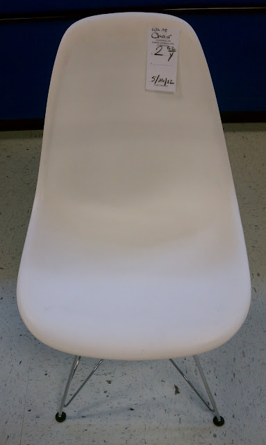
I used to think that I would have to wait a lifetime to own an authentic piece of designer furniture. In fact, I was pretty convinced that I might never have the gumption to throw down several hundred (or several thousand) dollars for the real thing. Then I went to Goodwill on Saturday, and almost fainted.
I saw this little chair and thought, "Oh, that's a really cute "white chair" for only $2.92, and in excellent condition. We could totally rock that chair in our apartment!"
Then I thought, "Wait a minute!" and flipped that baby over.
Yes my friends, it was an authentic Charles and Ray Eames Chair dubbed "White Chair" for ONLY $2.92! I nearly fainted. I mean literally, my head got woosy and my heart started racing. I couldn't believe that...
1. a patron would give an authentic Eames ANYTHING to Goodwill
2. no one at Goodwill knew what this chair was worth, and that
3. someone, somewhere in the cosmos wanted me to own it.
Right place, right time. God is so good awesome!
In case you might be wondering what something like this would actually go for brand new check this out. And though mine is not brand-spankin' new, finding one in such awesome shape - mine was just a little dusty, no real surface scratches - I couldn't have found a sweeter deal.
I haven't decided quite yet where it's going to live amongst our other things, but one thing is for sure - this chair will definitely be staying in the family! So what do you think, deal of the century, or what?
found in
thrifting
So do you remember the sad kitchen that I created a design for during my interview? Well, I've pretty much finished it! It was a long process, but the project definitely evolved into something that I am truly proud of. Although the initial design concept for each area remained the same, one huge component changed - the color scheme. Because my main responsibility is to increase sales (in this case sales in the kitchen department) I had to work with an exotic granite countertop that the kitchens department wanted to push, which shifted the color scheme from bright and colorful, to graphic and monochomatic. The whole design plan organically shifted over the period of a few weeks, which gave me a pretty awesome learning experience. The end result is pretty dramatic. Check it out!
R82- Before
R82- After
Aside from designing spaces from scratch, a huge responsibility of an interior designer at IKEA is to revitalize roomsets from a sales standpoint (sales steer towards particular articles) and of course from an inspirational standpoint (fresh, new design solutions for customers). This room was a challenge because most of the large furniture pieces had to stay the same. How do you uplift a room without taking a wrecking ball to the place and starting over? You re-analyze the living situation to improve the function, change the color scheme, and the change the accessories!
Now to show you how organic this process can be. Remember the space to the left of the column?
Here's a sketch of my original vision.
Here's what it became. Work IKEA was actually having a problem getting
rid of a particular long black bracket and a glass desk that was similar
to the Ekby Alex that I originally specified. So I worked in the
merchandise to help give them a boost.
Here is the children's space on the right side of the column.
And my sketch
Here's how it turned out. This idea, of course, was tweaked as well. I added height above the kids art with some grown-up art that I created. It's one yard of fabric that I tuned into a triptych. I also switched the chair for something more substantial when I learned that the Kritter chair wasn't a big priority. I definitely feel like I managed to transform an juvenile-feeling kids' space into a sophisticated one that's clean, simple, and balanced.
Here's a close-up of the Duktig kitchen area. I used Bastig hooks (cute little doggie butts) to hang the Lidan baskets since they're actually the only ones we sell that are kid-approved. :)
I later went back and softened the chair with a textile.
Notice how the window in the picture below is in the corner of the room. Well I had no idea that when re-designing a roomset I actually had the power to move it. My co-worker suggested that I should think about making it a more prominent feature in the room by installing it horizontally above the Varde unit. It worked out wonderfully!
Here's the idea that I had. Not bad, but definitely more knick-knacky that the Swedish Modern style expression actually called for.
This is the end result. Not too shabby, right? I made the curtains out of fabric by the yard (just hem tape and an iron) and our curtain rings. I also decided to railroad the fabric, which continued the horizontal line across the room created by the cabinets. I still plan on adding some graphics to the glass inserts on the unit to sell it as craft storage.
And here's the last area.
My sketch
This area changed completely, mostly due to the fact that the Bekvam spice rack has been out of stock since late last year (thanks to pregnant moms everywhere). I had also previously installed the Limhamn shelves in a different kitchen for more exposure and didn't want to repeat the solution. The final composition I settled on however, incorporates different products, but serve the same function. Oh, and later I switched out the towels for an oven mitt after they finally came back in stock. :) The picture in the frame is a drawing of a mom, dad, their son, and twin girls - drawn with my left hand!
Now for a few more detail shots.
I had this crazy idea to use wall stickers on the column. They actually turned out pretty chic, and I sold them to at least five people who walked by in awe as I was installing them! Oh, and the color on the walls is "Blair Gold" by Benjamin Moore. It definitely warms up the cabinetry like the "Super White" walls never could.
The table looks so much better. I love a set table! This one says, we may have children, but we still throw dinner parties in this house!
And here's another long shot in the other direction. The living situation evolved only slightly. I ended up adding another Urban Jr. chair to bring home the fact that their were two small children in this kitchen (in this case twin girls) and placed them on the ends on the table. We've had a lot more interest in those chairs since they finally have some good exposure. Same goes with the barstools (before their were none). I decided not to change the lighting over the island because this room has often been used as an event/workshop room in the store, so it's fairly easy to wind up the cords and attach the fixtures to the grid. I do however plan on moving them over to the center of the island and making sure they're a little more even in height. The one over the table was changed, and I think it adds a little more masculinity to the space.
Like most roomsets, this one will continue to evolve over time, but as of now, I can say that it's the best it's ever been. I'm pretty happy with it. Going forward I'll be adding some child safety merchandise to fully bring home the idea of "living with children". And I also want to give a shout out to my sweet co-worker, Robin, for all her guidance through this whole process. You're totally awesome, and I really enjoy working with you! So what do you guys think of the transformation? Dramatic, eh? :)
Subscribe to:
Posts (Atom)


Social Icons