I just wanted to drop in and share what my team and I have been up to! Recently we refreshed the showroom entrance to make a stronger impression for this year's theme which is "living with textiles" For the before and after effect, check out our first implementation here. This time I was assigned the sewing studio (which was previously a dining room) and the youth room (which was previously a lounge). Check out the photos!
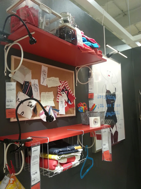
I really loved this space because it was all about color! I really gravitate towards bright, bold color, so I truly felt right at home. In fact, I would love to have a space as cool as this in my home where I could tinker around and create beautiful things.
Of course I drew inspiration from the Gullvi fabric faces.
Here's a photo of what it looked like before -
Who said new paint, furniture, and fabrics can't transform a room?
It's like she just got up while she was in the middle of something...
Check out the PS boxes! I totally want them, but can't justify a place for 'em.
Odds and ends, sketches, scraps, task lighting...
Our manager, Michael created an outdoor space that is literally as cute as a button. It was attached to my space, so it felt as though the same super chic lady lived there. I'll tease you for a moment, and show you later. P.S. How adorable are the birds and the branches?
Here's the kitchenette, which I turned into a textiles dying studio.
Gotta have a place for hanging wet garments!
The other side was transformed into an entry landing.
Put on your shoes, grab your bag, glance at the time, check your lipstick, and you're out the door!
Here's the adorable outdoor space.
And it's full of color, so you know that I was completely enchanted!
The graphics really make it feel like you've been transported to the country.
And how neat is this wall? I need a bigger outdoor space, like yesterday.
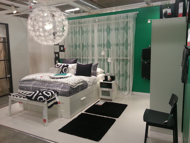
Marianne was in charge of the middle bedroom, which was previously red and white. She made the black and white room pop with Pantone's color of the year, Emerald.
It actually came across quite peaceful and luxurious. I could totally live there.
Robin focused on the first room which felt like an amazing lodge in the mountains.
I mean honestly, how cool is it? Very.
I mean honestly, how cool is it? Very.
Here's an idea of how the rooms led to one another. Pretty cool, eh?
On the other side, I focused on the junior room, which turned out to be red and white again.
Not to worry though, I rocked it out all the same.
Not to worry though, I rocked it out all the same.
My favorite part about the space was the wall that we wrapped in mdf that was covered in vinyl fabric. I punched it up with white frames and a Tradig bowl turned upside down as a cool, modern shade. Between you and me, I love it.
This time around, we totally went for more function, like our traditional roomsettings, so the way I propped this space was kind of reminiscent of a dorm room.
Marianne focused on the room right off of the escalator, which may be the most graphic of all. If I walked into someone's home and it looked like this, I would never want to leave. It's just so happy!
I love the fabric on the Besta doors, and it made me want a wall of
Besta just so that I could do this.
I love the sofas facing one another too.
I love the sofas facing one another too.
Robin focused on the small balcony, as well as the bedroom next to my "dorm room".
Spring time in the country! Adorable!
I really like the bed alcove too. It went from continental dark to Swedish country.
How cute is the peek-a-boo window?
On the other side is a crib, which unfortunately in our showroom is quite rare. The rug on the wall is pretty awesome, and really transforms a typical nursery into a sophisticated space.
Here are the ladders on the other side and a peek onto the balcony!
Michael also transformed the podiums in the entrance, which look quite chic. This one totally makes me want to attempt my own Palbo stool cover. P.S. You would not believe how many customers want to snatch these covers (which were made by our seamstress) off and take them to the cash lanes. Wipe the dust off of your sewing machine, people! These covers are going to be a little labor of love.
And here's the last podium. I don't even have to tell you which one I gravitate to. It's pretty obvious!
So, this is what our team has been up to! I love my team to pieces, and I'm super proud of what were were able to accomplish in just three short weeks. We're pretty darn awesome. :) What do you think?


.jpg)


.jpg)


.jpg)


I been following ur blog ever since u took the last movie sofa in pool...joke. I was trying to purchase that sofa so I googled reviews and came upon ur blog. I love that sofa by the way. U gave me courage to go ahead and purchase the sofa in that color. Lss, when I went to purchase it in Chicago it was discontinued. I'm a designer in my head only and I love how u put things together. Keep posting.
ReplyDelete